Free Table to Chart Maker — Turn Excel Tables into Statistical Charts Online
Paste your data or upload Excel — get a beautiful statistical chart in seconds. 11 chart types, fully in your browser. No sign-up, no watermark, ever.
How to Turn Your Table into a Chart?
Step 1 — Enter Your Data(Paste, Upload, or Type)
Step 2 — Pick a Chart Type & Generate
➜
Free forever · No sign-up · No watermark — just paste your data and create.
A Statistical Chart Maker for Every Type of Data
Spline Chart
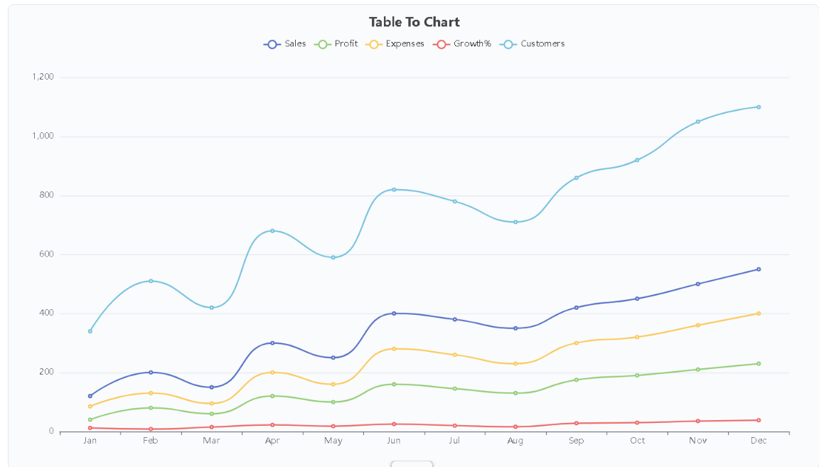
Also known as a spline chart. Uses smooth curves to connect data points, eliminating sharp corners in the line for a more fluid trend. Suitable for displaying continuous data over time, such as monthly growth rates or daily temperature changes. The X-axis typically represents a continuous variable (e.g., time), and the Y-axis represents specific values. Example: Showing the company's 12-month revenue growth curve.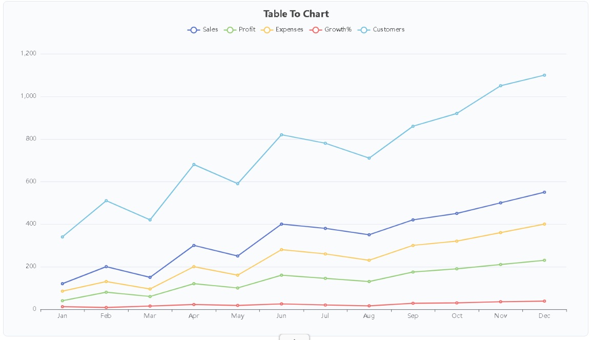
Line Chart
Also known as a line chart. Presents data as a series of data points connected by straight line segments, visually showing trends over a continuous time period. The X-axis typically represents a continuous variable (e.g., time), and the Y-axis represents values. Ideal for tracking metric changes over time and comparing different datasets over the same period. Example: Comparing quarterly sales changes between last year and this year.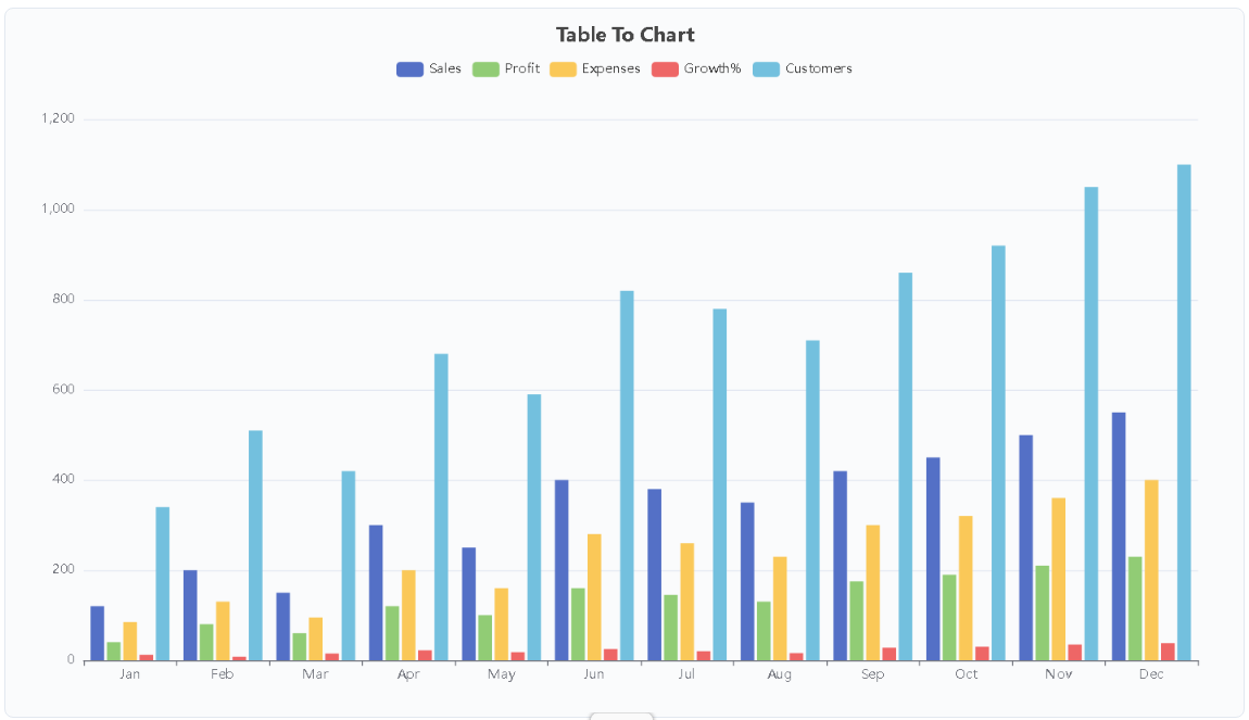
Column Chart
Also known as a column chart. Uses the height of rectangular bars to represent values, with each bar's height proportional to the value it represents. Best suited for comparing non-continuous categorical data, especially when there are few categories and labels are short, enabling clear and direct data comparison. Example: Quarterly sales comparison by product line.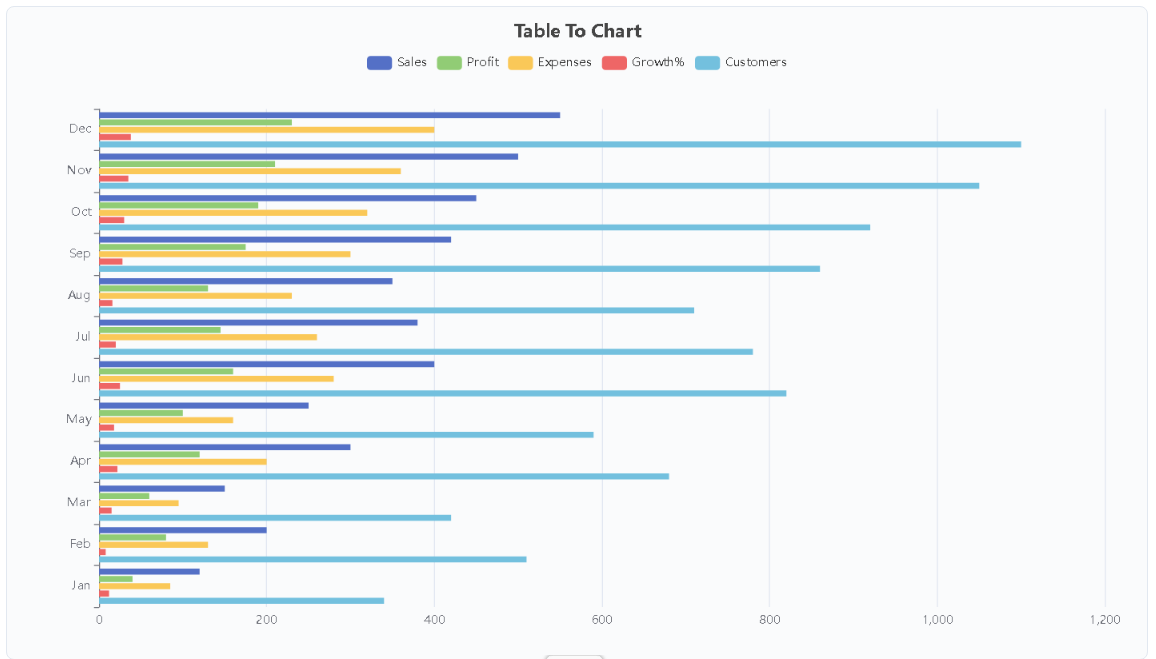
Bar Chart
Also known as a horizontal bar chart. Uses the length of horizontal bars to compare data, with each bar's length proportional to the value it represents. The horizontal layout provides ample space for long labels, making it ideal for ranking data. Example: GDP rankings by country, user satisfaction survey results.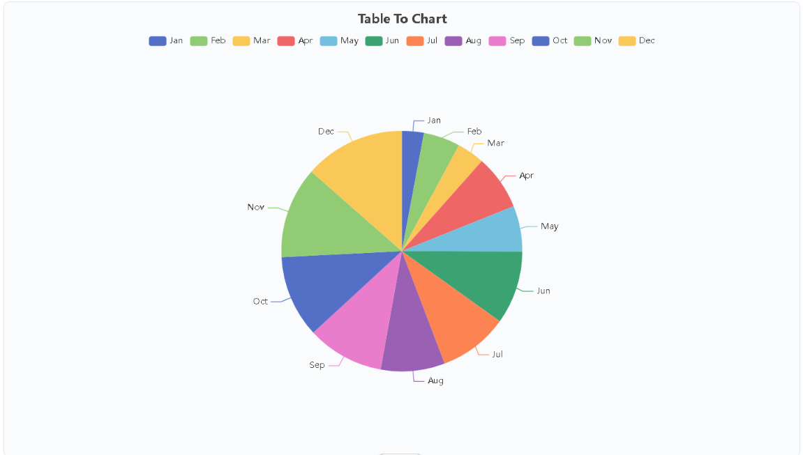
Pie Chart
Also known as a pie chart or sector chart. A circular chart divided into sectors, with arc length proportional to the quantity it represents. Ideal for showing the composition of a single category of data, especially when there are few categories, providing an intuitive view of the part-to-whole relationship. Example: Budget allocation by department, market share distribution.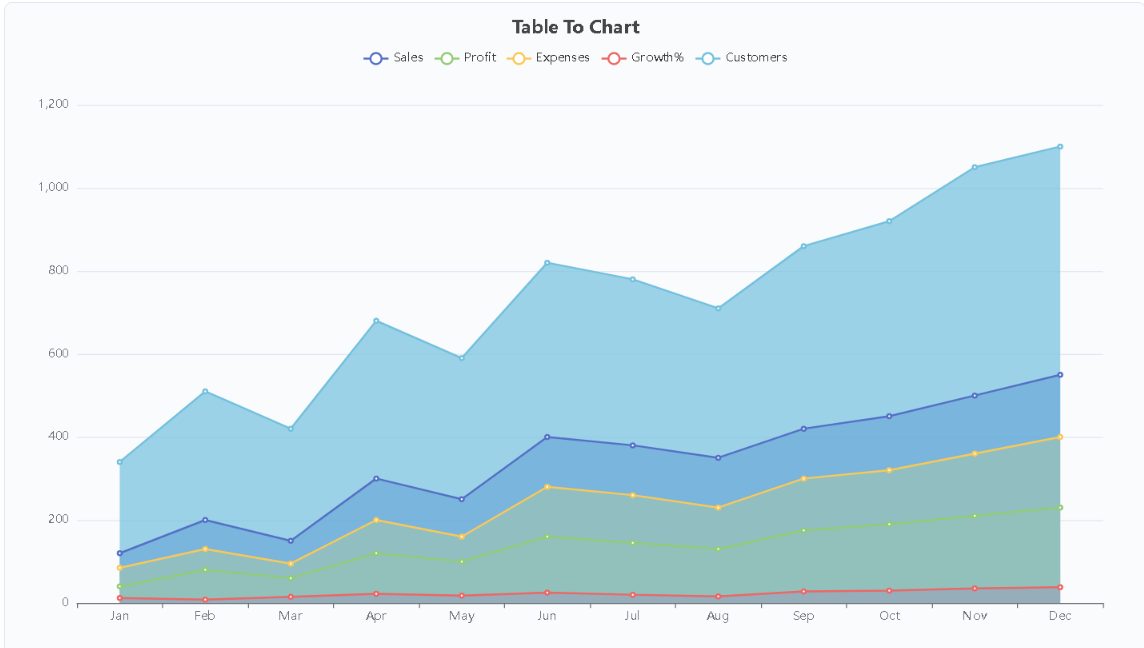
Area Chart
Also known as an area chart. Similar to a line chart, but fills the area between the line and the axis with color, showing both the trend and the total value and magnitude of change. When multiple series are stacked, it can show the contribution of each part to the whole. Example: Monthly total sales broken down by region, website traffic trends and growth intervals.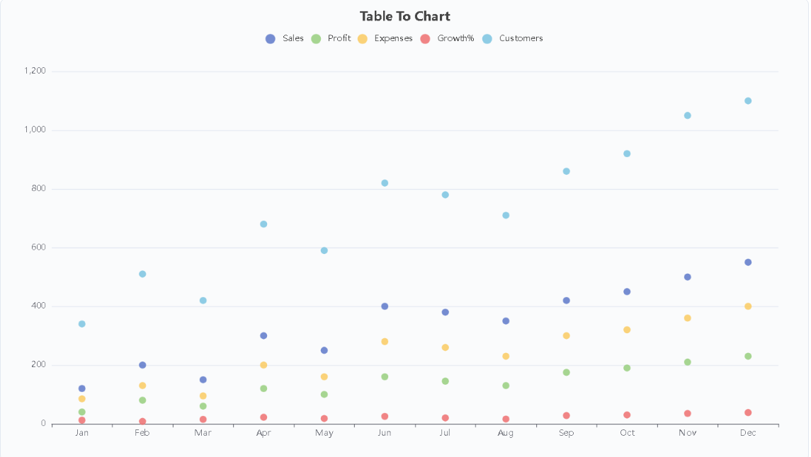
Scatter Chart
Also known as a scatter plot. Uses dots to represent the relationship between two numerical variables, with each dot's position on the horizontal and vertical axes corresponding to the values of the two variables. Used to observe correlations, identify data patterns, or clustering. Example: Correlation analysis between advertising spend and sales.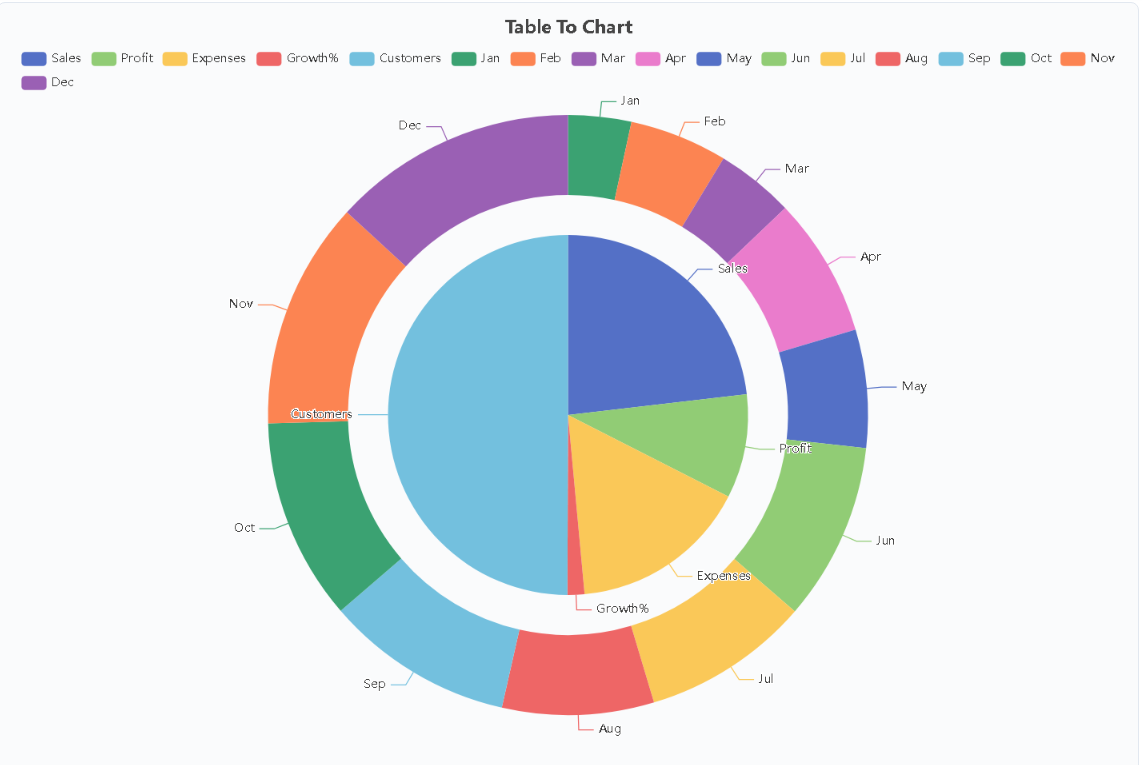
Dual Ring Chart
Also known as a nested pie chart or double pie chart. Features inner and outer rings nested for comparison, with the inner ring summarizing totals by column and the outer ring breaking down details by row. Suitable for two-level category comparison, presenting both overall and detailed information at once. Example: Total sales by region (inner ring) broken down by month (outer ring).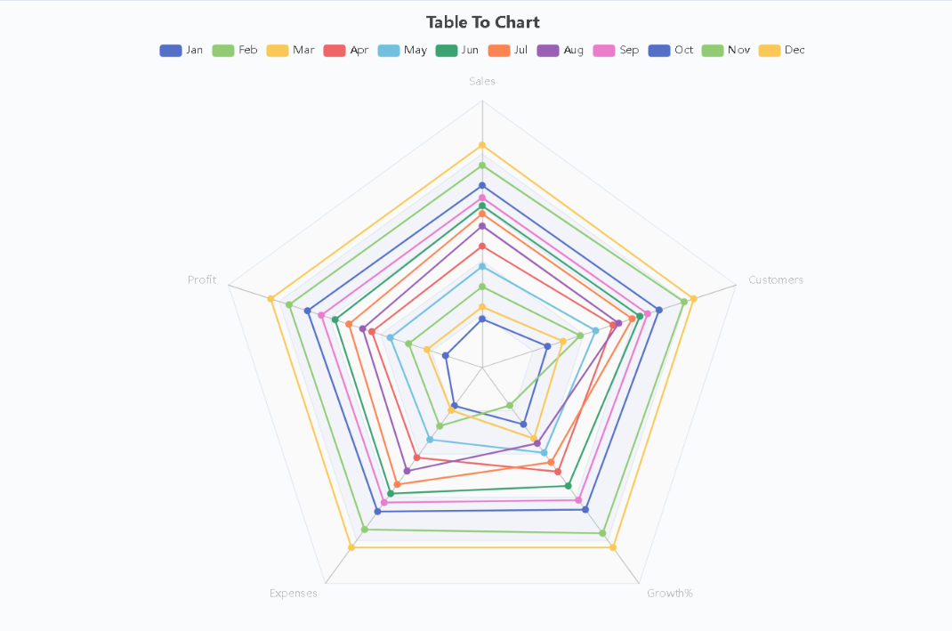
Radar Chart
Also known as a spider chart. Displays multi-dimensional indicators on multiple axes radiating from a central point in polar coordinates, with data points connected to form a polygon. Suitable for comprehensive capability assessment and multi-dimensional comparison, intuitively reflecting balance and strengths/weaknesses across dimensions. Example: Product performance comparison across multiple rating dimensions.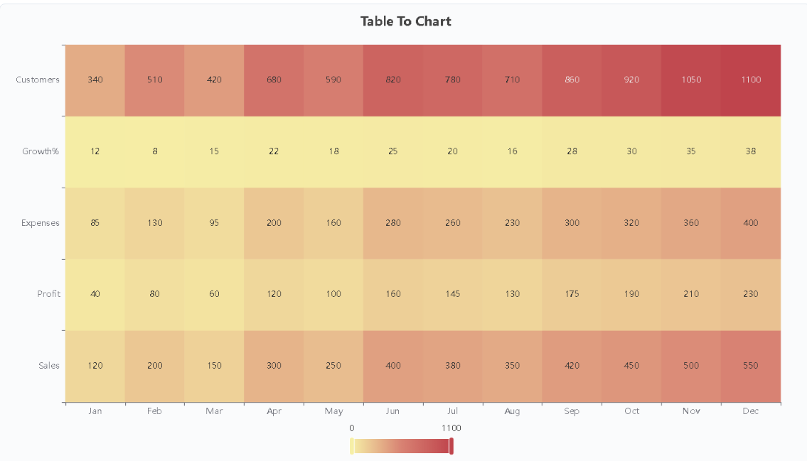
Heatmap
Also known as a heat map. Uses color intensity to show the density and distribution of values in a data matrix, with darker colors indicating larger values. Suitable for discovering patterns and outliers in large matrix data. Example: Hourly website visit heatmap for a week.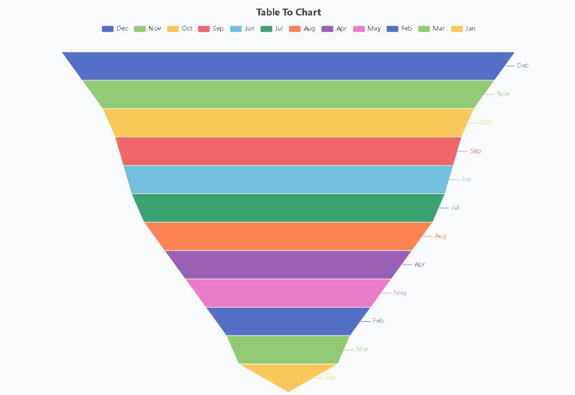
Funnel Chart
Displays data volume changes from top to bottom in a funnel shape, with each stage's width representing the data volume at that stage, intuitively reflecting the gradual decrease from start to end. Ideal for conversion rate analysis and progressive relationship scenarios. Example: Conversion rates from browsing to purchase at each stage.Frequently Asked Questions About Our Chart Generator
What chart types does Table To Chart support?
The online Excel-to-chart tool currently supports: Spline Chart, Line Chart, Column Chart, Bar Chart, Pie Chart, Area Chart, Scatter Chart, Dual Ring Chart, Radar Chart, Heatmap, and Funnel Chart.
What data formats are supported for online table editing? What editing features are available?
You can directly input data in the table, upload Excel files (.xlsx/.xls), or paste data from spreadsheet software. Common features include: editing cells, inserting rows or columns, deleting rows or columns, and sorting by column.
Does this Excel-to-chart tool use AI? I don't see an AI feature entry.
Currently, the website has only a few AI features configured, which are hidden and almost imperceptible during use. As we receive more feedback, we will continuously upgrade AI features to make table editing more convenient for you!
Is my uploaded or edited table data secure? Do you store my data?
Your table data is processed only locally in your browser and is not sent to the website server. The AI optimization feature only temporarily reads table data to help the chart tool better understand the table, but does not store table data.
Can I freely use the generated charts? Are there any usage restrictions?
There are no usage restrictions on charts generated on this platform! You can freely use them for work reports, study materials, personal sharing, etc. Best of all, all generated charts are watermark-free! Download them for free after generation to make your data presentation more professional and flexible!